Why Aesthetic App Icons Are More Important Than You Think
You know, it’s funny how often we underestimate the power of something so small. When I open my phone, what's the very first thing that truly catches my eye? It’s not the app’s functionality, not its intricate features – it’s its icon. That tiny square of digital art is often the entire basis for a user’s initial judgment and, frankly, whether they’ll even bother tapping on your app in a crowded app store. I’ve come to realize that an app's icon isn’t just a pretty picture; it’s a silent salesperson, a brand ambassador, and the gateway to your digital experience. It's a critical element that deserves our absolute attention, especially in today's fiercely competitive mobile landscape.
Think about it for a second. We’re bombarded with options daily. Our home screens are battlegrounds, aren't they? A well-designed, aesthetically pleasing icon stands out, draws the eye, and communicates professionalism and care. Conversely, a poorly designed one can scream 'amateur' even if the app behind it is brilliant. My perspective is that icons have to work harder than ever before. They need to be recognizable, memorable, and convey the app's core purpose or brand personality almost instantaneously. This isn’t just about looking nice; it’s about user acquisition and retention.
The Evolution of App Icon Aesthetics: From Skew to Flat and Beyond
I’ve witnessed quite a journey in app icon design over the years. It truly has been fascinating! We've seen trends come and go, each leaving its mark on what we consider 'aesthetic' today.
Skeuomorphism: The Early Days
- Early Apple days: Initially, icons tried to mimic real-world objects. Remember the old iBooks icon that looked like an actual bookshelf, or the notes app that resembled a yellow legal pad? I thought it was pretty cool at the time! This style, known as skeuomorphism, aimed to make digital interfaces feel familiar and intuitive by drawing parallels to physical items.
- Pros: Highly intuitive for new users, felt tactile.
- Cons: Could look cluttered, didn't scale well, often lacked a sense of modern simplicity.
Flat Design: The Revolution
Then came the big shift. Microsoft, with its Metro UI, and later Apple, with iOS 7, really spearheaded the move towards flat design. This was a radical departure, emphasizing clean lines, bold colors, and a lack of three-dimensional effects. For me, it was a breath of fresh air; it felt much more aligned with the digital nature of the devices themselves.
- Characteristics: Minimalist, uses solid colors, sharp edges or subtle rounded corners, focuses on typography and iconography.
- Why it worked: Improved readability, faster loading, scalable, and gave a sense of modernity and clarity.
Material Design: Google's Influence
Google’s Material Design took flat design and added a clever twist: simulated depth through shadows and animations. It's like flat design got a subtle, elegant upgrade. I appreciate how it gives a sense of hierarchy and interaction without going back to full skeuomorphism. It’s got a very clean, structured feel that I find very appealing.
Gradients and Glassmorphism: Modern Touches
More recently, we've seen a resurgence of gradients, often vibrant and multi-hued, adding depth and visual interest without overwhelming the icon. And glassmorphism, with its frosted glass effects and subtle transparency, has also popped up. It creates this really cool layered look. I’ve noticed a lot of designers are having fun playing with these techniques to make icons pop without feeling overly busy.
Key Principles for Designing Truly Aesthetic App Icons
Alright, so we’ve touched on history; now, how do we actually *make* an icon look good and work well? From my experience, a few core principles consistently lead to successful designs.
1. Simplicity is Golden
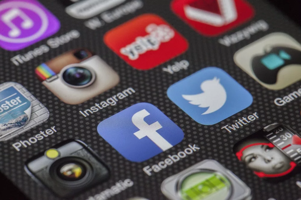
I can’t stress this enough: less is often more. An icon has limited space, right? Don’t try to cram too much in. A single, clear, immediately recognizable element or symbol is usually far more effective than a busy, complex scene. Think about Twitter’s bird or Instagram’s camera – super simple, super iconic.
2. Brand Consistency Matters
Your app icon isn’t an isolated piece of art. It's part of a larger brand identity. I always make sure the icon’s colors, typography (if any), and overall style align with the app’s UI and marketing materials. This creates a cohesive and professional experience for the user. It builds trust, you know?
3. Color Psychology and Vibrancy
Colors evoke emotions and convey meaning. I think carefully about what feelings I want my app to inspire and choose colors accordingly. Bold, vibrant colors often stand out better on a cluttered home screen, but they also need to harmonize. Avoid clashing combinations that can be jarring to the eye.
4. Scalability and Readability
Your icon will appear in various sizes – from a tiny favicon to a large App Store listing. It must look good and be readable at every single size. I always test designs on different devices and resolutions to ensure every detail remains clear, not pixelated or squashed.
5. Platform Guidelines: Don't Ignore Them!
Apple and Google both have extensive human interface guidelines and Material Design specifications, respectively. These aren't just suggestions; they’re pretty crucial. They dictate things like corner radius, safe areas, and even recommended color palettes. Sticking to these guidelines ensures your icon feels native and professional on its respective platform. I've found that ignoring them can lead to rejection or, at best, an icon that just feels